Comox is a vibrant coastal town that is located on the east coast of Vancouver Island. This small town offers many services as well as boutique shopping, restaurants and cafes and is the gateway to a full service marina, pristine parks and beaches and offers incredible mountain views.
—
We were asked to refresh and modernize the branding for the Downtown Comox Business Association to better reflect the wide variety of shopping, restaurants and cafes, amenities, and services the area has to offer.
- Graphic Design
- Photography
- Branding
- Display & Signage
- Photography
LOGO UPDATE
We wanted to keep the concept from the previous logo, but give the icon, wordmark and colours a brighter, more modern aesthetic.
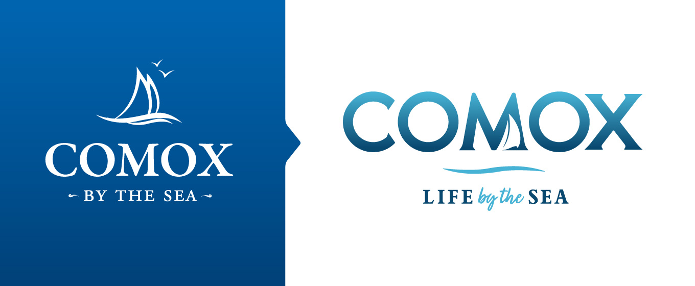
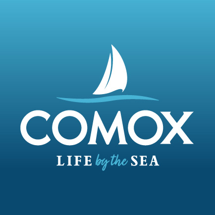
The wordmark is a 100% custom font designed to be modern and clean, by using a geometric/sans serif font styles, yet professional by incorporating subtle serifs to pay homage to the original. The icon is simplified to a single sailboat and the wave icon is separated from the boat to be used as a dividing graphic between the logo and tagline or on its own. The tagline is updated so it can be used separately as it’s own design/marketing element in various formats and colours. The secondary version of the logo ‘stacks’ all the elements individually to allows flexibility based on the application while keeping the overall branding cohesive.


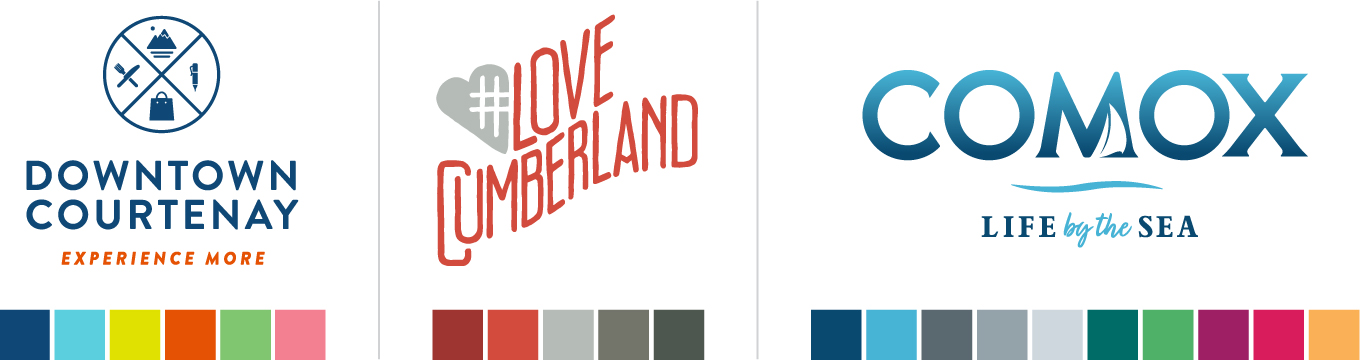
COLOURS & STYLES BETWEEN COMMUNITIES
Since the Comox Valley is made up of three separate communities and downtown areas, each with their own distinct style, it was important to take a step back and properly consider how this branding would work alongside, yet stand apart, from its neighbours.
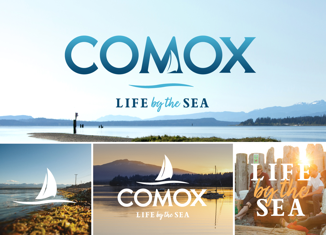
PHOTOGRAPHY
We regularly take photos to capture the lifestyle of Comox to be used in various marketing materials.


Next time you’re exploring Downtown Comox, be sure to explore all the unique businesses that make up this part of the Comox Valley culture.