LOGO & BRAND UPDATE
PREVIOUS LOGO
UPDATED LOGO
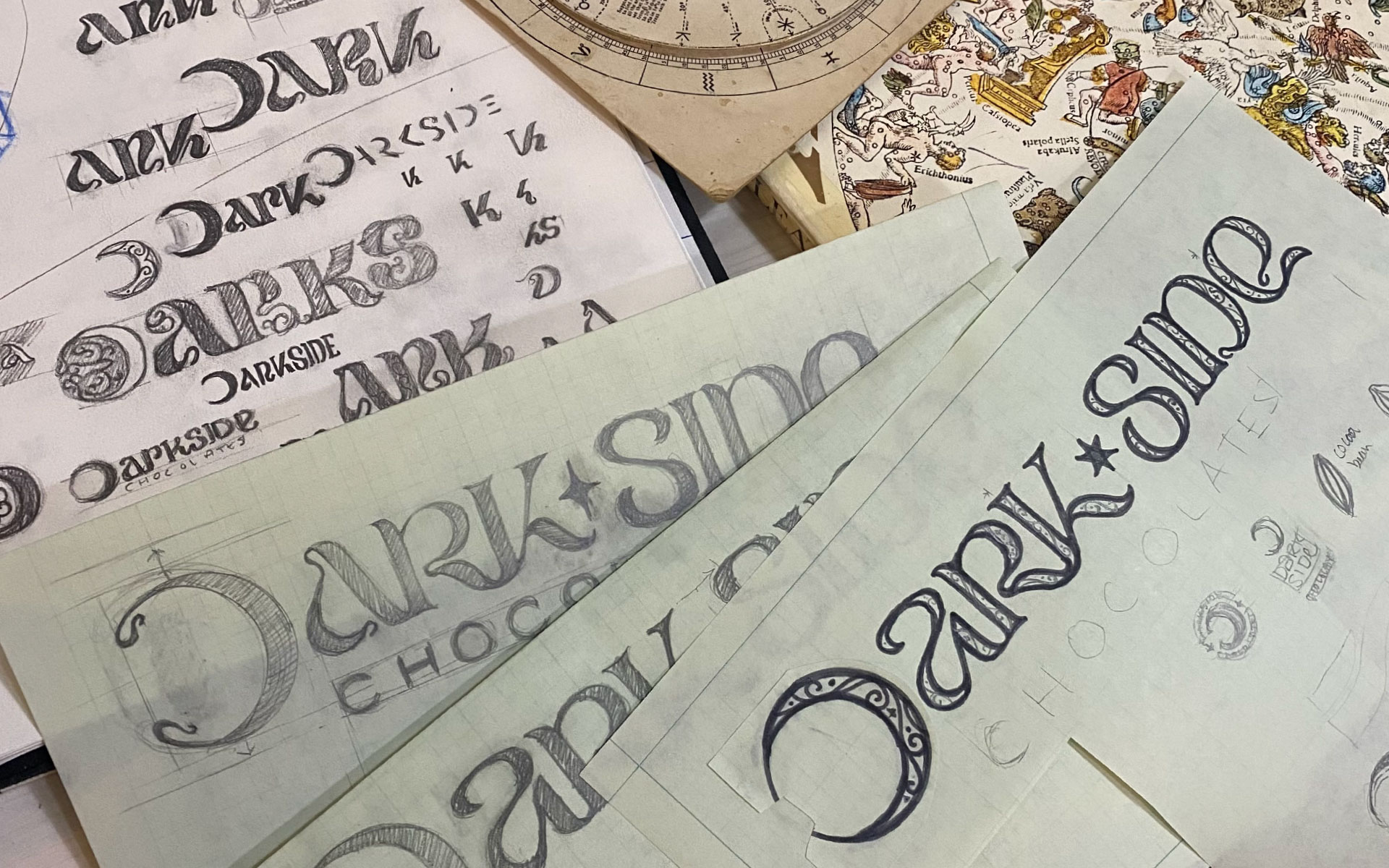
CONCEPT SKETCHES
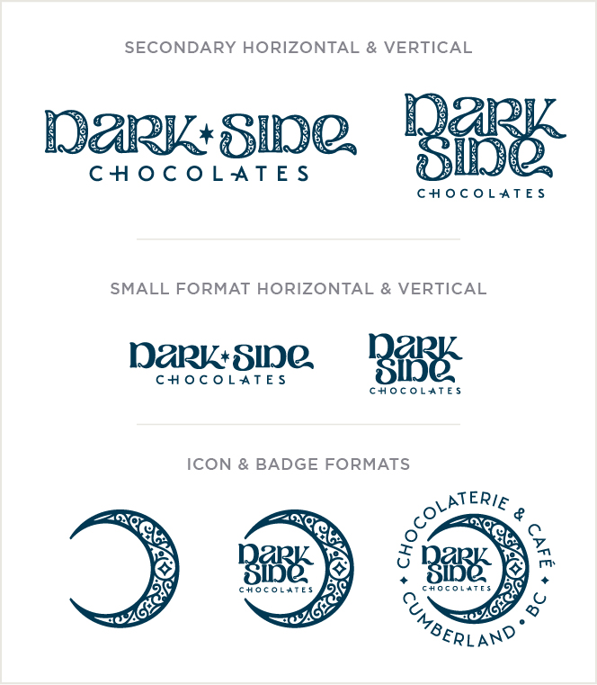
LOGO VARIATIONS
PACKAGING
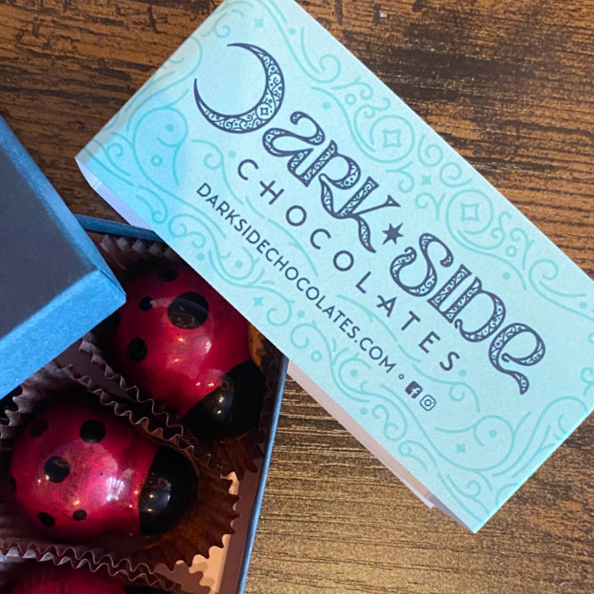
As part of the rebrand we developed a new look for the supporting graphics that mimicked the details within the logo itself, and used the primary colour palette for their tru e boxes and bands. We wanted to make sure all their other packaging stood out from one another by creating a supporting colour palette for all the individual items based on the ingredients and flavours, which included icons for each worked into the background pattern.
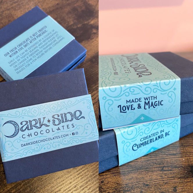
BOX BANDS
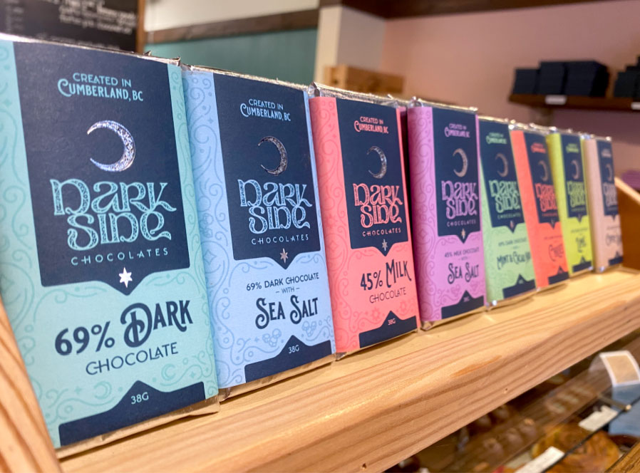
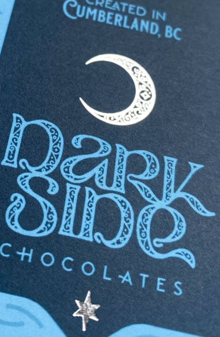

BAR WRAPS & ICONS
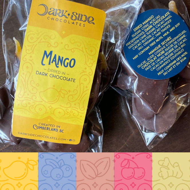
LABELS & ICONS
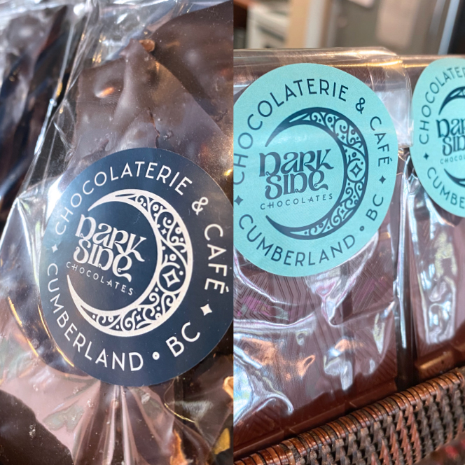
STICKERS

SIGNAGE
No brick & mortar location is complete without proper signage. We designed a unique hanging sign to grab attention of both locals and tourist alike. Combined with clear & legible signage on the door/windows with typographical details to attract the eye to draw people inside. We also created number of little details for inside to add a bit of design beauty to the normally mundane.
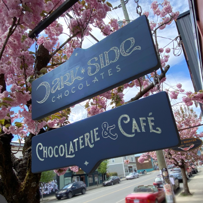
HANGING SIGN
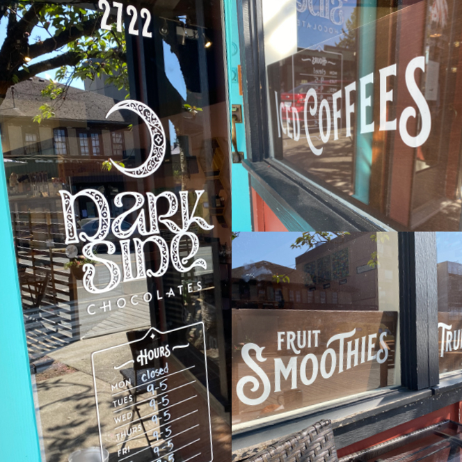
EXTERIOR SIGNAGE
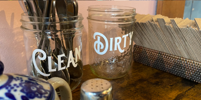
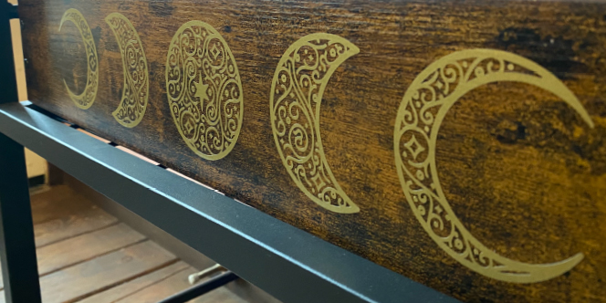
INTERIOR SIGNAGE
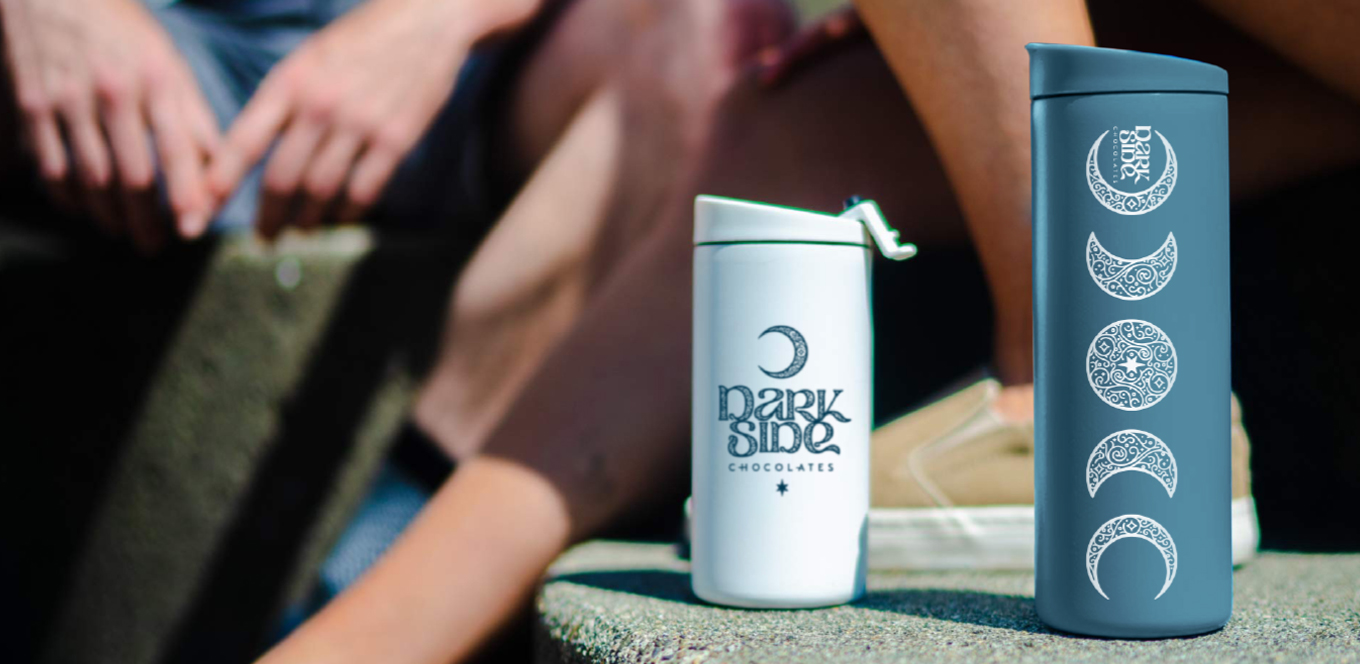
MERCH CONCEPTS
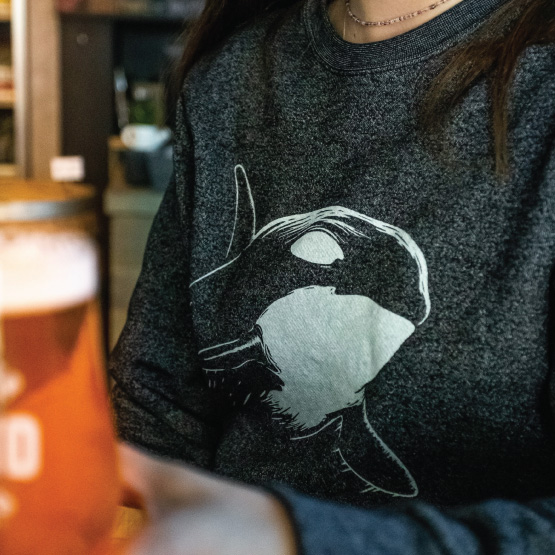
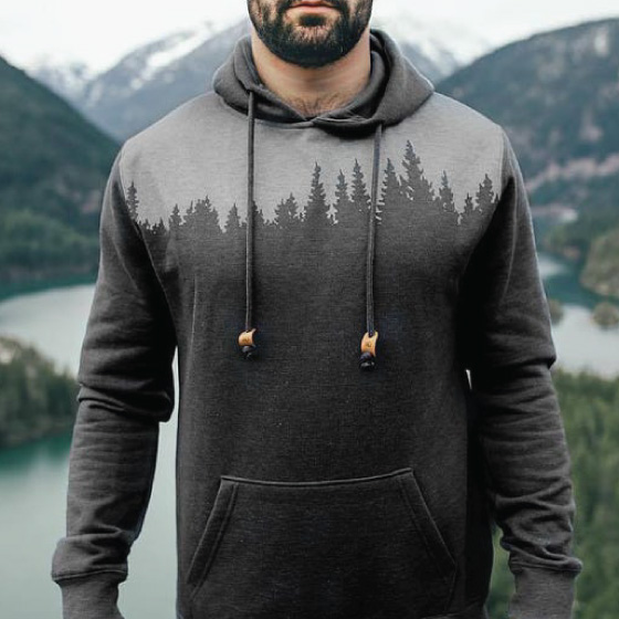
As part of the presentation for the overall brand we also created some ideas for potential merchandise.
Learn more at Dark Side Chocolates, stop in next time your exploring Cumberland, or check them out on instagram or facebook.
