Edible Island has been providing the Comox Valley with affordable, high quality organics and products since 1980. From their beginning roots in rural Merville they are now proudly the leading independent organic whole food retailer in the Comox Valley. Located in the heart of Downtown Courtenay for over 30 years, they provide a wide range of products for organic lifestyles, the gluten-free community, vegetarians, food sensitivities, health conscious families, fitness folks, old timers, and everyone in between.
—
We were originally asked to help with the illustration of a new mural, but after the initial planning session we suggested this might be an opportunity to look at refreshing the branding, to revitalize the companies overall look and feel, and accompany the new mural design.
- Graphic Design
- Illustration
- Branding
- Display & Signage
- Marketing Collateral
- Mural
- Typography
LOGO & BRAND UPDATE
ORIGINAL (1980) & PREVIOUS LOGOS
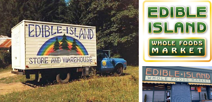
UPDATE LOGO
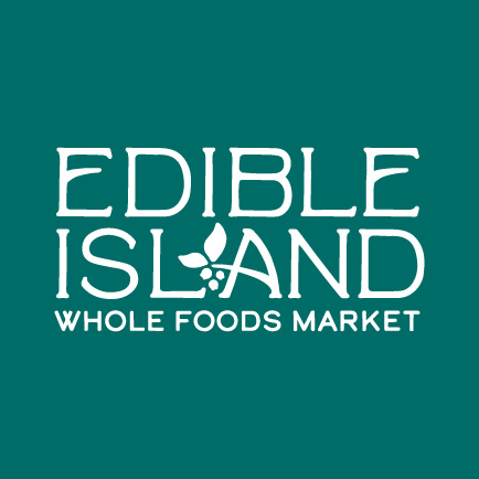
The goal was to pay homage to Edible Island’s heritage by incorporating elements of the previous logos into the new word mark. A small icon of leaves and locally-found salal berries is incorporated to the logo to help fill the gap and reinforce the local-sourcing approach of Edible Island.

SUPPORTING COLOURS & GRAPHICS
The primary colour palette was created to reflect the land and sea, where all the products available in the store are sourced from. The secondary colours are a vibrant rainbow to compliment the primary colours while also reflecting the inclusive culture of Edible Island.
PRIMARY & SUPPORTING COLOURS

SUPPORTING GRAPHICS

Leaf shape from within the logo is repurposed into supporting graphics on marketing materials.
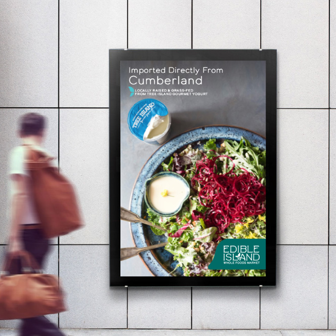
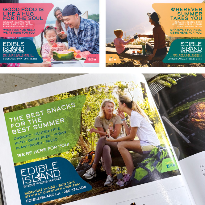
MARKETING MATERIALS
All marketing and promotional materials we designed to be flexible, yet cohesive. All variations and formats of promotional materials use a consistent application of the supporting graphics and logo, but allow for the support colour to change to best emphasize the image. Imagery of healthy food and lifestyle are used to reinforce the brand and products available at the market.
POSTERS
ADVERTISMENTS
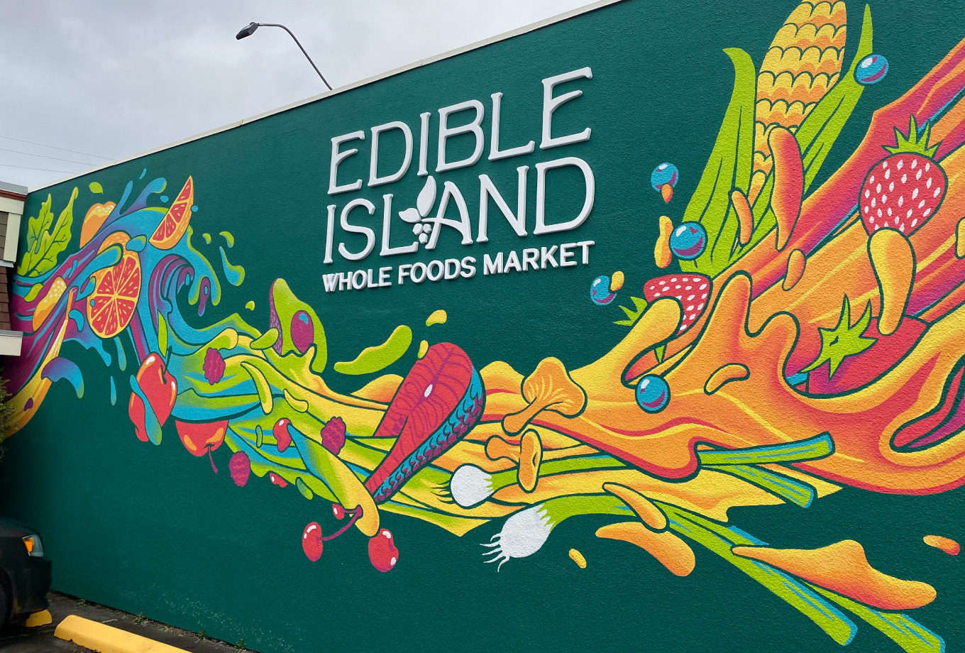
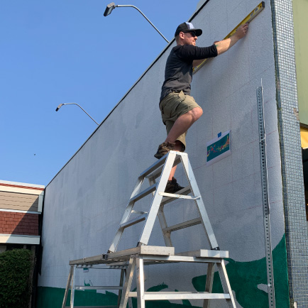
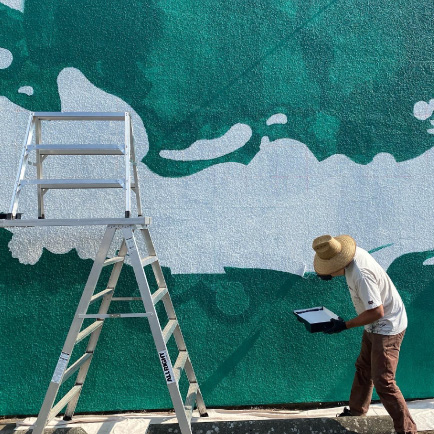
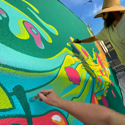
MURAL & SIGNAGE
The mural was designed to simply be vibrant and eye-catching to draw attention towards the building itself. The ‘wave’ utlizes the full spectrum of the brand colours, and focuses on fresh produce to make it clear what you can find inside.
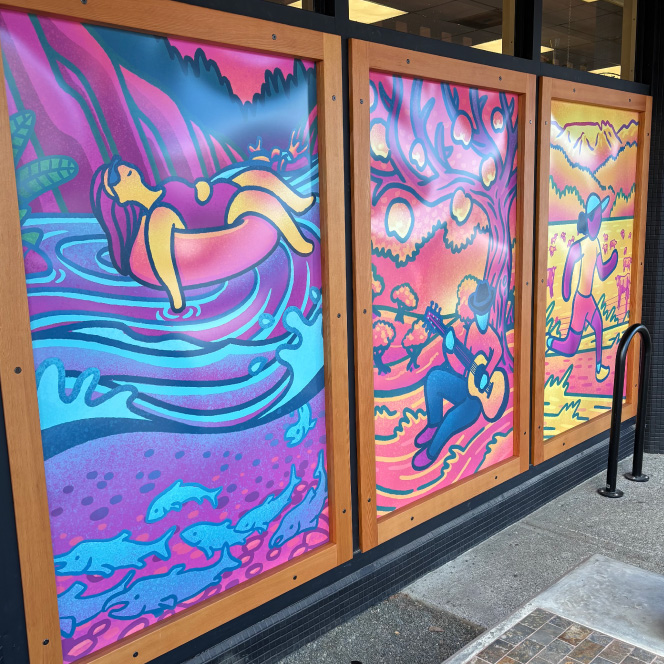
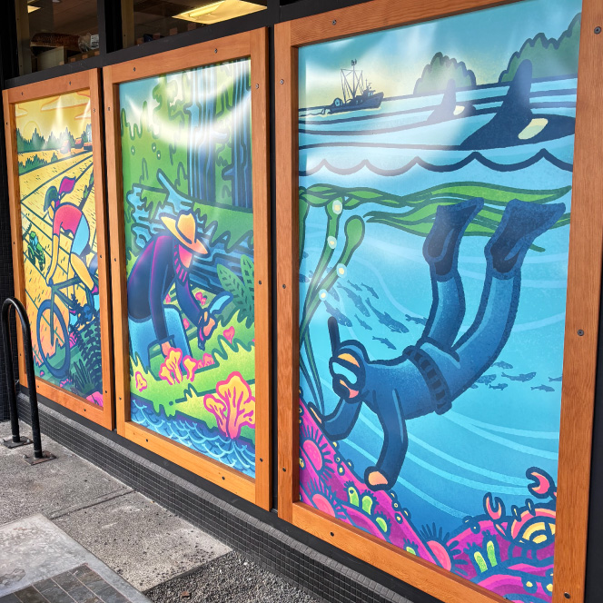
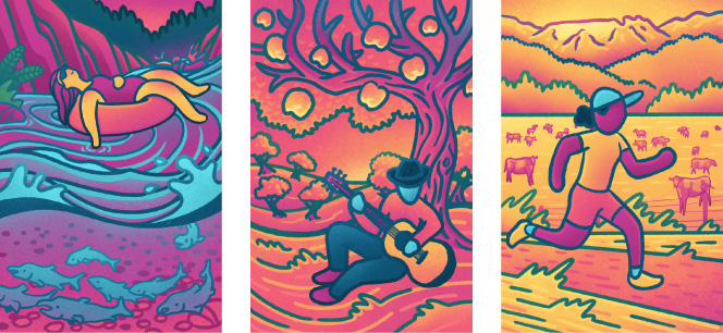
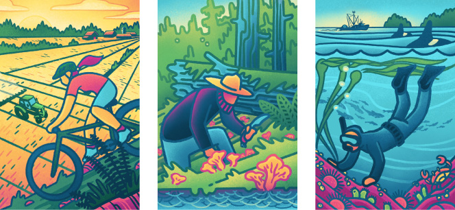
FRONT WINDOW PANELS
The front window panels illustrations focus on showing people, local locations and their relationship to where our local food comes from. Like the mural, the panels use the full range of colours, and are purposefully designed to blend from one to the next, so that when you step back it creates the full colour spectrum/rainbow to reinforce the Edible Island’s core value of supporting an inclusive and diverse community.